Sunday, 11 May 2014

Wednesday, 7 May 2014

Final Poster

digipack draft 3

Question 1: In What Ways Does Your Media Product Use, Develop or Challenge Forms and Conventions of Real Media Products?
In What Ways Does Your Media Product Use, Develop or Challenge Forms and Conventions of Real Media Products?
My Music Video promotion conforms to music video conventions by following existing styles of music videos and conforming to theorists ideologies and methods.
When researching music videos I noticed that they fell into three groups, performance, narrative and abstract. The style of my music video is a narrative telling the story of the song, I have approached this in an ironic sense, the music video lyrics 'still alive' are taken in an ironic sense with the character eventually committing suicide. When researching music videos I noticed that music videos largely consisted of videos that reflected the lyrics been sung, to challenge this I made sure to use the song in ironic terms not applying the usual conventions of a music video. However my music video also includes parts of performance with the star of the video appearing in my video.
I used the slow editing with constant slow camera movement from Lisa Miskovsky's Music video 'Got A Friend'. In the music video the editing is slow paced but reflects the mood of the song, the video also compromises of long shots mixed with close up shots, I have combined these together in my music video making sure to reflect the original mood of the song and increasing editing speeds where necessary.
Mt music video has a slow rhythm and pace to it and whilst it tells a stormy it doesn't have a real meaning behind it, my music video follows the 'Surface without substance' Post modern theory set out by Fredrick Jameson, because whilst my music video is appealing it doesn't have a large moral message or deeper meaning. This is common in music videos and can be seen in real world examples such as Lady Gaga's applause which is a show of Lady Gaga changing from a dancer to a swan. This application of the theory was crucial to my music video and is reflected by my music video looking visually appealing and providing surface entertainment
I challenged the traditional music video complex of a love story between two main characters, this can be seen in music videos such as You Make Me by Avicii in which the characters have a fight but ultimately the main male character that the audience were for gets the girl and they go off together happy. I challenged this in my music video by having the main characters fall out of love and ultimately drive them so far apart that by killing on of the characters I could make sure that the audience would realise that the characters would never get back together and I could completely invert the conventions.
In my Digipack I have followed conventions existing on real life examples, these include the placement of fonts and logos. I have made sure to look at the Indie Genre in particular and during my research I learned that the Covers usually reflect the same thing showing a single female on a colourful background, I made sure to follow this whilst also having the existing conventions of the placement of models, logos and the overall presentation of the final product.
following the conventions in my digipack creation was difficult because I had to create something that would match my music video in the same style. I included both of my artist and model together on the front of the album cover to create identification of the artists in the music video.
My Music Video promotion conforms to music video conventions by following existing styles of music videos and conforming to theorists ideologies and methods.
When researching music videos I noticed that they fell into three groups, performance, narrative and abstract. The style of my music video is a narrative telling the story of the song, I have approached this in an ironic sense, the music video lyrics 'still alive' are taken in an ironic sense with the character eventually committing suicide. When researching music videos I noticed that music videos largely consisted of videos that reflected the lyrics been sung, to challenge this I made sure to use the song in ironic terms not applying the usual conventions of a music video. However my music video also includes parts of performance with the star of the video appearing in my video.
I used the slow editing with constant slow camera movement from Lisa Miskovsky's Music video 'Got A Friend'. In the music video the editing is slow paced but reflects the mood of the song, the video also compromises of long shots mixed with close up shots, I have combined these together in my music video making sure to reflect the original mood of the song and increasing editing speeds where necessary.
Mt music video has a slow rhythm and pace to it and whilst it tells a stormy it doesn't have a real meaning behind it, my music video follows the 'Surface without substance' Post modern theory set out by Fredrick Jameson, because whilst my music video is appealing it doesn't have a large moral message or deeper meaning. This is common in music videos and can be seen in real world examples such as Lady Gaga's applause which is a show of Lady Gaga changing from a dancer to a swan. This application of the theory was crucial to my music video and is reflected by my music video looking visually appealing and providing surface entertainment
I challenged the traditional music video complex of a love story between two main characters, this can be seen in music videos such as You Make Me by Avicii in which the characters have a fight but ultimately the main male character that the audience were for gets the girl and they go off together happy. I challenged this in my music video by having the main characters fall out of love and ultimately drive them so far apart that by killing on of the characters I could make sure that the audience would realise that the characters would never get back together and I could completely invert the conventions.
In my Digipack I have followed conventions existing on real life examples, these include the placement of fonts and logos. I have made sure to look at the Indie Genre in particular and during my research I learned that the Covers usually reflect the same thing showing a single female on a colourful background, I made sure to follow this whilst also having the existing conventions of the placement of models, logos and the overall presentation of the final product.
following the conventions in my digipack creation was difficult because I had to create something that would match my music video in the same style. I included both of my artist and model together on the front of the album cover to create identification of the artists in the music video.
Question 2
How Effective Is The Combination Of Your Main Product And Ancillary Texts?
Before creating the music video I went out and took test shots around various locations to get a feel of how I wanted the music video to look, to decide on a style that would match I took various photographs showing the different enviroments and this allowed me to decide on my final shooting locations. The locations were important becuase they would influence how the audience would feel about the characters and the motives and intentions of the characters.
When creating the ancillery texts I originally wanted to go for a hand drawn look to the image which would have nearly all of the colour removed to match the music video, however I involved the artist on the cover and included her on the ancillery texts, this meant adjusting the transparency and feathering of the image at the edges to achieve the look, lacking in colour and fading away against the background.
Using the same colour scheme across the main text and ancillery text was important, this was achieved by making the characters dress in dark colours to match the dark colours of the ancillery texts. The bright colours of the main prodict was portrayed through the use of colour explosions which were achieved by using a downloaded space brushes pack which was then modified and layered to create the cosmos shown on the ancillery texts. The amont of colour in the music video is purposely lacking because it alters the mood of the product and also changes audience expectations as set up in the main text.
I use both the main product and ancillery texts to build up the image of the artist, becuase of this the ancillery texts influenced parts of the music video and the music video influenced parts of the ancillery texts. The ancillery texts contain editied direct screenshots from the final music video which creates brand recognition of the artist helping individuals identify the products relations easier.
Before creating the music video I went out and took test shots around various locations to get a feel of how I wanted the music video to look, to decide on a style that would match I took various photographs showing the different enviroments and this allowed me to decide on my final shooting locations. The locations were important becuase they would influence how the audience would feel about the characters and the motives and intentions of the characters.
When creating the ancillery texts I originally wanted to go for a hand drawn look to the image which would have nearly all of the colour removed to match the music video, however I involved the artist on the cover and included her on the ancillery texts, this meant adjusting the transparency and feathering of the image at the edges to achieve the look, lacking in colour and fading away against the background.
Using the same colour scheme across the main text and ancillery text was important, this was achieved by making the characters dress in dark colours to match the dark colours of the ancillery texts. The bright colours of the main prodict was portrayed through the use of colour explosions which were achieved by using a downloaded space brushes pack which was then modified and layered to create the cosmos shown on the ancillery texts. The amont of colour in the music video is purposely lacking because it alters the mood of the product and also changes audience expectations as set up in the main text.
I use both the main product and ancillery texts to build up the image of the artist, becuase of this the ancillery texts influenced parts of the music video and the music video influenced parts of the ancillery texts. The ancillery texts contain editied direct screenshots from the final music video which creates brand recognition of the artist helping individuals identify the products relations easier.
Question 3
What have you learned from audience feedback.
On the side of my blog I ran a Poll which allowed people to select from the questions what type of music they listened to what their age groups were and what they preffered in types of artist style.
This blog poll showed my the average age of my demographic was between ages 16-19. This meant I would have to targety this demographic more specifically as well aiming to see what this age group found appealing in current media forms, to do this

I placed a news banner at the top of my blog which would cycle through news related to the keywords film and media as well as music, this would allow me to see what was current in the charts and what was appealing for audiences.

The poll also allowed me to directly ask my target demographic what they thought was the most important aspect of the music video, the most common answer being a tie between Performance and Mise-En-Scene, this meant that the majority of the my audience members would look at the visual parts of the music video rather than the cinematography aspects. However this could just show that the target demographic simply do not understand the amount of importance the other aspects of the video are and so how important it is to the music video. To make sure the video would be visually appealing I created a short narrarive which could occur throughout the music video which audiences could expect to see as a convention in the music video.
After the blog poll was complete I used this infomation to create my music video with my target demograpic in mind.
Once the music video was completed I worked on a questionnaire which would show me what the target audience actually thought about the final product and what adjustments I needed to change in the video to reach my maximum potential outcome.
When asking the original questionnaire I asked a group of ten people, this included people wirhin the targeted age group but also people older and younger than the target age group. This way I would have a better understanding if my target audience enjoyed the finished product or not. After getting back positive feedback regarding the music video and its Narrative I took this into consideration when re-editing and re-filming sections of the video to focus on the negative parts of the original draft such as it having some shots take too lonf and others not take long enough. after re-editing the music video I again handed out a questionnaire to the same group of people asking them what they thought about the re-edited video, the questionnaire showed that apart from the shorteded length of the music video it worked well.
Audience feedback influenced my work from the beginning of preproduction to reassesing the finished piece of work. Audience feedback was essencial because it showed me what my target demographic thought about my music video and allowed me to make changes to the final product that the target audience wanted and could give their feedback about.
On the side of my blog I ran a Poll which allowed people to select from the questions what type of music they listened to what their age groups were and what they preffered in types of artist style.
This blog poll showed my the average age of my demographic was between ages 16-19. This meant I would have to targety this demographic more specifically as well aiming to see what this age group found appealing in current media forms, to do this
I placed a news banner at the top of my blog which would cycle through news related to the keywords film and media as well as music, this would allow me to see what was current in the charts and what was appealing for audiences.
The poll also allowed me to directly ask my target demographic what they thought was the most important aspect of the music video, the most common answer being a tie between Performance and Mise-En-Scene, this meant that the majority of the my audience members would look at the visual parts of the music video rather than the cinematography aspects. However this could just show that the target demographic simply do not understand the amount of importance the other aspects of the video are and so how important it is to the music video. To make sure the video would be visually appealing I created a short narrarive which could occur throughout the music video which audiences could expect to see as a convention in the music video.
After the blog poll was complete I used this infomation to create my music video with my target demograpic in mind.
Once the music video was completed I worked on a questionnaire which would show me what the target audience actually thought about the final product and what adjustments I needed to change in the video to reach my maximum potential outcome.
When asking the original questionnaire I asked a group of ten people, this included people wirhin the targeted age group but also people older and younger than the target age group. This way I would have a better understanding if my target audience enjoyed the finished product or not. After getting back positive feedback regarding the music video and its Narrative I took this into consideration when re-editing and re-filming sections of the video to focus on the negative parts of the original draft such as it having some shots take too lonf and others not take long enough. after re-editing the music video I again handed out a questionnaire to the same group of people asking them what they thought about the re-edited video, the questionnaire showed that apart from the shorteded length of the music video it worked well.
Audience feedback influenced my work from the beginning of preproduction to reassesing the finished piece of work. Audience feedback was essencial because it showed me what my target demographic thought about my music video and allowed me to make changes to the final product that the target audience wanted and could give their feedback about.
Question 4
using technology in the planning stage
Technology in the planning stage was important because it allowed me to research and effectively plan the production of my music video.
When researching the style of music video I wanted I used various websites to create a better understanding of the genre and its audience. The websites used included Sonymusic.co.uk, sonymusic.se and fueledbyramen.com. These websites allowed to understand the different stars that fall under the genre and helped me to find out what genre my original artist came under.
The preproduction required me to create an animatic which meant producing a hand drawn storyboard which I completed on Paper an iPad app for iPad and then produced the animatic using FinalCutProX for Mac OSX to produce the final animatic. The development of the Animatic was greatlty sped up by the use of the iPad because it allowed me to work on the images faster and create small changes to the image at later dates.
When producing the music video I filmed on The Fuji film HS20EXR which allowed me to film during my own freetime and because of the versatility of the of camera I could achieve some unpractical shots such as when I had to film off the edge of the block over the river. The problem with the camera was auto focus locking because the camera wanted to readjust all of the time some of the shots were ruined and had to be re shot. The Camera did however allow me to readjust the focusing on the image including rapid refocusing on the image, this effect was also readjusted later on when editing in post production.
To edit I used My MacBook Air and FinalCutProX, this program allowed me to edit my music video using tools similar to professional grade level. The program in particular using the advanced trim tool allowed me to precisely choose which parts of the clips I wanted to apply to the final music video. the edit suite also allowed me to apply a type of bug eye filter to my work to create the same shot repeatedly over the same area, this effect was rectangular lenses.
The production of my CD/DVD digipack was done in Photoshop CS6 for Mac the image was created using firework brushes which were adjusted to properly fit the scale, I adjusted the pressure placed upon the brushes as well as the fade distance to ensure that the images would appear distant and faded as to fit into the image and be a background image rather than a main one. The main image was apart of the artist only shown in red and 5% transparency this means that the artist is on the image but to achieve the theme I was going for is faded into the distance and blends in well with the constellation ideas that I had set out to create. The Font source was Dafont although all fonts on the cover were adjusted to fit the style that I was aiming for including colour overlays and readjusting the edging of the image.
Technology in the planning stage was important because it allowed me to research and effectively plan the production of my music video.
When researching the style of music video I wanted I used various websites to create a better understanding of the genre and its audience. The websites used included Sonymusic.co.uk, sonymusic.se and fueledbyramen.com. These websites allowed to understand the different stars that fall under the genre and helped me to find out what genre my original artist came under.
The preproduction required me to create an animatic which meant producing a hand drawn storyboard which I completed on Paper an iPad app for iPad and then produced the animatic using FinalCutProX for Mac OSX to produce the final animatic. The development of the Animatic was greatlty sped up by the use of the iPad because it allowed me to work on the images faster and create small changes to the image at later dates.
When producing the music video I filmed on The Fuji film HS20EXR which allowed me to film during my own freetime and because of the versatility of the of camera I could achieve some unpractical shots such as when I had to film off the edge of the block over the river. The problem with the camera was auto focus locking because the camera wanted to readjust all of the time some of the shots were ruined and had to be re shot. The Camera did however allow me to readjust the focusing on the image including rapid refocusing on the image, this effect was also readjusted later on when editing in post production.
To edit I used My MacBook Air and FinalCutProX, this program allowed me to edit my music video using tools similar to professional grade level. The program in particular using the advanced trim tool allowed me to precisely choose which parts of the clips I wanted to apply to the final music video. the edit suite also allowed me to apply a type of bug eye filter to my work to create the same shot repeatedly over the same area, this effect was rectangular lenses.
The production of my CD/DVD digipack was done in Photoshop CS6 for Mac the image was created using firework brushes which were adjusted to properly fit the scale, I adjusted the pressure placed upon the brushes as well as the fade distance to ensure that the images would appear distant and faded as to fit into the image and be a background image rather than a main one. The main image was apart of the artist only shown in red and 5% transparency this means that the artist is on the image but to achieve the theme I was going for is faded into the distance and blends in well with the constellation ideas that I had set out to create. The Font source was Dafont although all fonts on the cover were adjusted to fit the style that I was aiming for including colour overlays and readjusting the edging of the image.
Monday, 5 May 2014

Wednesday, 19 March 2014
creating the background
To create the background I first had to research for styles similar to the one I wanted to portray, this meant websearches of supernovas and outerspace cosmos. After I had done this and looked at the various styles I had to locate the brushes that would enable me to create my own versions.
creating the stars meant creating a sepreate layer for each of the colours.


Changing Of The Style Of Music Video.
I am changing the style of the music video, the video will no longer feature Lauren Wilson as my stsr, the video will have another actor in it, the actor will be reacting along to the narrative of the song, this will be taken in an ironic sense because the character will commit suicide despite the fact that the song is called still alive. This means that the overall style of the music video will change, as will its intended meaning and message.
The intended message was originally supposed to be one of betrayal, love and forgiverness, this was going to be shown through the Mis-En-Scene, which, consisting of having the main performer dancing around in a forest, this would ultimatly end in the main character walking off into the sunset, it would have consisted mainly of abstract performance. The music wouldn't have really linked to the music video much in that it would have reflected part of the performace but otherwise they would have not really linked together.
In the new music video the lyrics closer link to the Mis-En-scene, they link through the fact that when the lyrics say 'come fire, come fire let it burn', I filmed inside a burned building to show the significance of the character walking alone. the character is an empty shell of their former selves as reflected in the house which is a burned out shell of its former glory. The overall narrative is linked closer because the character commits suicide in the video. This is taking the lyrics in an ironic sense, the lyrics 'I'm Still Alive' will be ironic if the character commits suicide instead of living and moving on with their life without the female in the video. It can also mean that the singer of the song is still alive and is singing the song to show that she has moved on without the male in the video and no longer feels responsible for his death and is moving on.
The intended message was originally supposed to be one of betrayal, love and forgiverness, this was going to be shown through the Mis-En-Scene, which, consisting of having the main performer dancing around in a forest, this would ultimatly end in the main character walking off into the sunset, it would have consisted mainly of abstract performance. The music wouldn't have really linked to the music video much in that it would have reflected part of the performace but otherwise they would have not really linked together.
In the new music video the lyrics closer link to the Mis-En-scene, they link through the fact that when the lyrics say 'come fire, come fire let it burn', I filmed inside a burned building to show the significance of the character walking alone. the character is an empty shell of their former selves as reflected in the house which is a burned out shell of its former glory. The overall narrative is linked closer because the character commits suicide in the video. This is taking the lyrics in an ironic sense, the lyrics 'I'm Still Alive' will be ironic if the character commits suicide instead of living and moving on with their life without the female in the video. It can also mean that the singer of the song is still alive and is singing the song to show that she has moved on without the male in the video and no longer feels responsible for his death and is moving on.
Wednesday, 12 March 2014
Digi-pak Draft 2

This draft was important because I united the use of fonts on the album artwork, this meant changing all of the fonts on the enitre thing and recolouring and recreating them. The source of the fonts was Dafont,com, this website allowed me to use fonts that would better match the genre and they gave me a wider range to souce my fonts from.
I am going to experement with the album art by removing the backgrounds and seeing whether that looks too basic or whether it would make the main artist image stand out and be more pronounced on the album art. I have removed the spines from this draft because I feel they need to be redesigned to fit into my genre more.
Wednesday, 5 March 2014
Digipack 6 Disc Draft 1

This first draft of my Album cover doesn't contain the image of my star, I wanted to experement with the album cover without the star being featured on it, I have decided to follow the conventions of the album cover widely seen in the indie genre and will be adding images of the star. I have also decided not to keep the title that is currently featured on this draft I will be changing it for a font that better relects the style of music video.
Tuesday, 31 December 2013
Drawing in the style.


Thursday, 19 December 2013
Reception theory - Theory
This theory is an active audience theory which sees the
audience as being actively engaged in the interpretation of media texts rather
than as passive consumers. Individuals receive and interpret texts in different
ways.
This theory demonstrated that even though one message is
sent out that not one understanding is made from the text.
This theory allows for a media text to be consumed
individually and take into consideration the meaning of a text and the
relationship between the individual.
The study of semiotics encoding and decoding
This theory says that media texts are encoded by the
producer (the people who make media texts) and these texts are full of
ideologies values and messages
The text is then decoded by an audience, however not all
audiences will decode and respond to the text in the same way. In some cases
this is not what the producer intended.
How encoding and decoding works
When a producer creates a text it is encoded with a
meaning or message intended to be conveyed to the audience. This is called the preferred
meaning.
This theory will sometimes be correctly decoded and the
audience will understand what the producer wants them to.
Sometimes the producer can encode a message which is not
a message that is not completely understood by making a message ineffective.
Audience
types
Hall
identified three different types of audience readings
Dominant
or preferred
Negotiated
Oppositional
How
can understanding be determined?
Many things can affect which reading we take (from the above)
Life experience
Mood at the time of viewing
Age
Culture
Beliefs
Gender
Many things can affect which reading we take (from the above)
Life experience
Mood at the time of viewing
Age
Culture
Beliefs
Gender
By using recognised codes and conventions, and by drawing
upon audience expectations relating to aspects such as genre and use of stars,
the producers can position the audience and thus create a certain amount of
agreement on what the code means. This is the preferred meaning.
Semiotics - Theory
Semiotics- Semiotics, also called semiotic studies is the
study of signs and sign processes (semiosis), indication, designation,
likeness, analogy, metaphor, symbolism, signification, and communication.
Semiotics is often divided into three branches:
Semantics:
Relation between signs and the things to which they refer; their denotata, or meaning
Syntactics:
Relations among signs in formal structures
Pragmatics:
Relation between signs and sign-using agents
The study of semiotics encoding and decoding
This theory says that media texts are encoded by the producer (the people who make media texts) and these texts are full of ideologies values and messages
The text is then decoded by an audience, however not all audiences will decode and respond to the text in the same way. In some cases this is not what the producer intended.
How encoding and decoding works
When a producer creates a text it is encoded with a meaning or message intended to be conveyed to the audience. This is called the preferred meaning.
This theory will sometimes be correctly decoded and the audience will understand what the producer wants them to.
Sometimes the producer can encode a message which is not a message that is not completely understood by making a message ineffective.
Hypodermic Needle - Theory
The hypodermic
needle is
an idea suggesting that an intended message is directly received and wholly
accepted by the receiver. The model is rooted in 1930s behaviourism and is
largely considered obsolete today.
The theory suggests that the mass
media could influence a very large group of people directly and uniformly by
‘shooting’ or ‘injecting’ them with appropriate messages designed to trigger a
desired response.
The "hypodermic needle theory" implied mass media had a direct, immediate and powerful effect on its audiences. The mass media in the 1940s and 1950s were perceived as a powerful influence on behaviour change.
The theory is now not widely recognised anymore in society today because there is not enough evidence to suggest the theory to be true. Only a small amount of the audience believe the press and would act on the ideas instigated by the press.
The classic example of the application
of the theory
was
illustrated on October 30, 1938 when Orson Welles broadcasted the radio edition of H.G. Wells' "War of the Worlds." On the eve of Halloween, radio
programming was interrupted with a "news bulletin" for the first
time. What the audience heard was that Martians had begun an invasion of Earth
in a place called Grover's Mill, New Jersey. The audience believed that this
news bullion was true and mass panic ensured with raided grocery stores and
interrupted religious services.
Media theorists have said that this
is the greatest example of the hypodermic needle theory. The broadcast
suggested that the media could manipulate the public, leading theorists to
believe that this is one of the primary ways media authors shaped audience
perception
Album Cover Drafting

The image was hand drawn on the Autodesk Express Application for Apple iPad. The images were then uploaded to dropbox to send them to the computer.
The image will be edited further with the lines straightened out and some removed. The image will also be colourised to further fit into the style of Julian Opie. The colouring of the image will also be completed on the Autodesk Express application, when colouring the image I will be removing detail from the skintones and replacing it with smooth block colours.


This is the First colourless draft.
Wednesday, 18 December 2013
Existing Album Covers

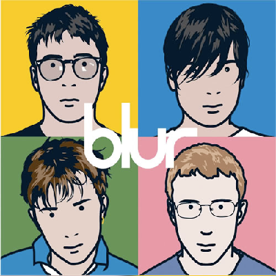
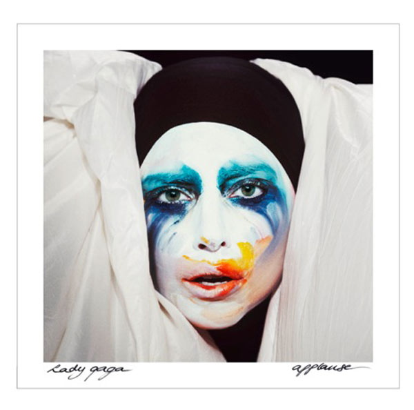

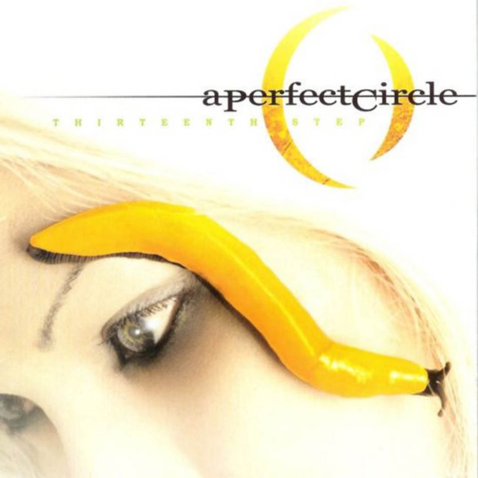
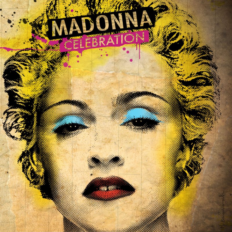


All of the selected album covers show the artist in a medium close up shot, this is to show the importance of the artist but also prompts the audience what artist is inside. An album cover shows the artist as the record company wants to portray them, this means that this is the only and 'ideal' way to portray the artist.
The Album covers all portray the artist with a unique style, nearly all of them portray the artist with an expressionless face, usually breaking the fourth wall and making eye contact with the audience targeted or otherwise.
The albums all feature individual looks making it impossible to confuse them, this makes them easier recognisable to the audience in a shopping environment. The backgrounds are usually also monotone with a basic colour to draw attention towards the artist . The album covers main purpose is to sell the artist to the audience and is at the forefront of doing so, it fits in with the phrase 'Don't Judge a book by its cover' although that is exactly what the audience do.
Monday, 16 December 2013
Makeup And Hair Tutorial
things applied to model
Hair- Texturising Gum This was applied to add a textured and messed up look to the models head.
Lips- red, black and white makeups, These were applied and removed and layered up to add a deeper colour to the models lips for filming.
Skin- red facepaint- this was applied then removed to give the model a more full complexion, it was also added to add more colour to the models cheeks.
Subscribe to:
Posts (Atom)